Strategy · 18 October 2026
A logo is not a brand
A logo is a brand's signature, not the brand itself. Here's the difference, with an example from Misho, and how it changes the way design decisions get made.
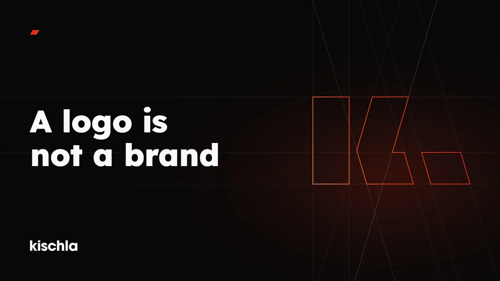
When a brand starts to look inconsistent, the first instinct is to redraw the logo. Often the logo isn’t the problem at all, and it only gets the blame because it’s the one part of the brand that anybody ever sat down and designed.
Knowing the difference stops the wrong diagnosis.
A logo is a signature
A logo is the signature a brand puts on things. You recognise it. You remember it, and when you see it on a package you know straight away who it belongs to. But a signature tells you very little about the person who signed.
On its own, a logo can’t carry what a brand says, how it behaves or how it makes you feel. Everything around the logo does that: the colours, the type, the language, the photographs, the packaging, the way a web page flows.
A brand is the whole
A brand is the sum of the impressions people pick up wherever they meet you. Some of it is visual. Some isn’t: how a question gets answered, how a box opens, how crowded a page feels, how long it takes to get a reply. All of that is part of the brand too.
As we like to put it, before a brand looks like anything, it has to say something. The logo is just one of the visible forms of what it says.
An example: Misho
Misho is an interior styling and gifting atelier. It calls its philosophy Organic Minimalism, and those two words came before the monogram.
The monogram we designed for Misho joins an M, a lotus and a butterfly. But the monogram isn’t carrying the brand alone. The four colours are named after materials: Aegean Soil, Wet Wood, Raw Linen and Sea Salt. The gift boxes, wrapping paper and labels belong to one family, and the stationery is embossed and letterpress printed. The social media and landing page layouts speak the same quiet language.
See the monogram on a box and you’ll recognise Misho. Take the monogram away and you’d still recognise it from the paper, the colour and the restraint. That’s the difference.
How the difference changes design decisions
A process that treats the logo as the brand pours all its energy into one file, and you end up with a good mark, a folder of exports and nothing that tells you, or the next designer, how to use any of it.
A process that treats the brand as a whole starts with other questions:
- What does this brand want to say, and to whom?
- Where do people come across it?
- Which colour, which typeface and which tone fit what it’s saying?
- Once those decisions are written down, how will the next person to work on the brand use them?
The logo comes out as one of the answers. Not the only one.
On our own brand
When we opened Kischla’s Instagram account, our first three posts were three words: Structure, Strategy, Design. Side by side, they make up the three parts of our K, and each part is paired with a word that says what we do. The K itself is built on a grid: an upright bar, then a chevron and a full stop that lean 16 degrees off upright. Lexend, in Light, Regular, SemiBold and ExtraBold, carries the type. One red, #DF2E17, carries the accent. The logo is the most visible part of that system, not the whole of it.
So when should you redesign your logo?
Sometimes a logo really has aged, or it contradicts what the brand says today. But before you decide, it’s worth asking one question: is the problem the logo, or the lack of any rules around it? If it’s the second, a new logo won’t fix it. It’ll just move the problem into a new file.
We’ve written about the parts a corporate identity is made of in What is a corporate identity?