Identity · 19 October 2026
What is a monogram logo, and which brands suit one?
A monogram is a mark built from a brand's initials. When it works, and how it's built, with examples from Misho, Prodarc and Pekin Yapı Market.
A monogram is a mark made from one or more letters of a brand’s name. It’s been used on seals, silverware and linen for centuries. Today it does the same job on an app icon, a profile picture or the lid of a box: it fits the whole brand into one shape.
Is a monogram the same as a logo?
Not quite. A logo is often a mark plus a wordmark. A monogram is a kind of mark, one that comes from a letter. A brand’s full logo might be the mark and the name together, while small spaces use the monogram alone.
That’s why a monogram can end up being one of the hardest-working parts of an identity. Think of where it turns up. The back of the business card, the social media avatar, a wax seal, the tiny icon in a browser tab that you only notice when you’ve got 20 tabs open.
When is it a good choice?
A monogram isn’t the right answer for every brand. It tends to work when:
- The name is long. A long name won’t read at small sizes. One letter will.
- The brand will live on lots of small surfaces. Packaging, labels, app icons, seals.
- There’s a family of products behind it. The same letter can be the shared signature of different products.
If your name’s already short and distinctive, or your letter’s easy to confuse with other brands, you might be better off with a symbol or a wordmark on its own.
Three examples, three very different monograms
Misho: one letter, two symbols
Misho is a luxury atelier for interior styling and gifting. Its monogram joins an M, a lotus and a butterfly in a single shape. Around it sit gift boxes, wrapping paper, labels, embossed and letterpress stationery, and a palette named after materials: Aegean Soil, Wet Wood, Raw Linen and Sea Salt.
Prodarc: an abstract letter from a grid
Prodarc is a cybersecurity start-up. Its mark is an abstract monogram drawn from the letter P on a 45-degree grid. The same monogram carries on, unchanged, across its two products, Prodarc SIEM and Prodarc SOAR.
Pekin Yapı Market: a hexagonal P
Pekin Yapı Market sells hardware and building materials. Its monogram is built on a hexagonal P. Alongside Pekin Red, Industrial Black and Pure White, the same mark runs through the business card, letterhead, flag, packaging and digital applications.
In all three, the letter does the same job, but they look nothing alike. An atelier, a cybersecurity start-up and a hardware store fit the same kind of mark in very different ways.
How to build a good monogram
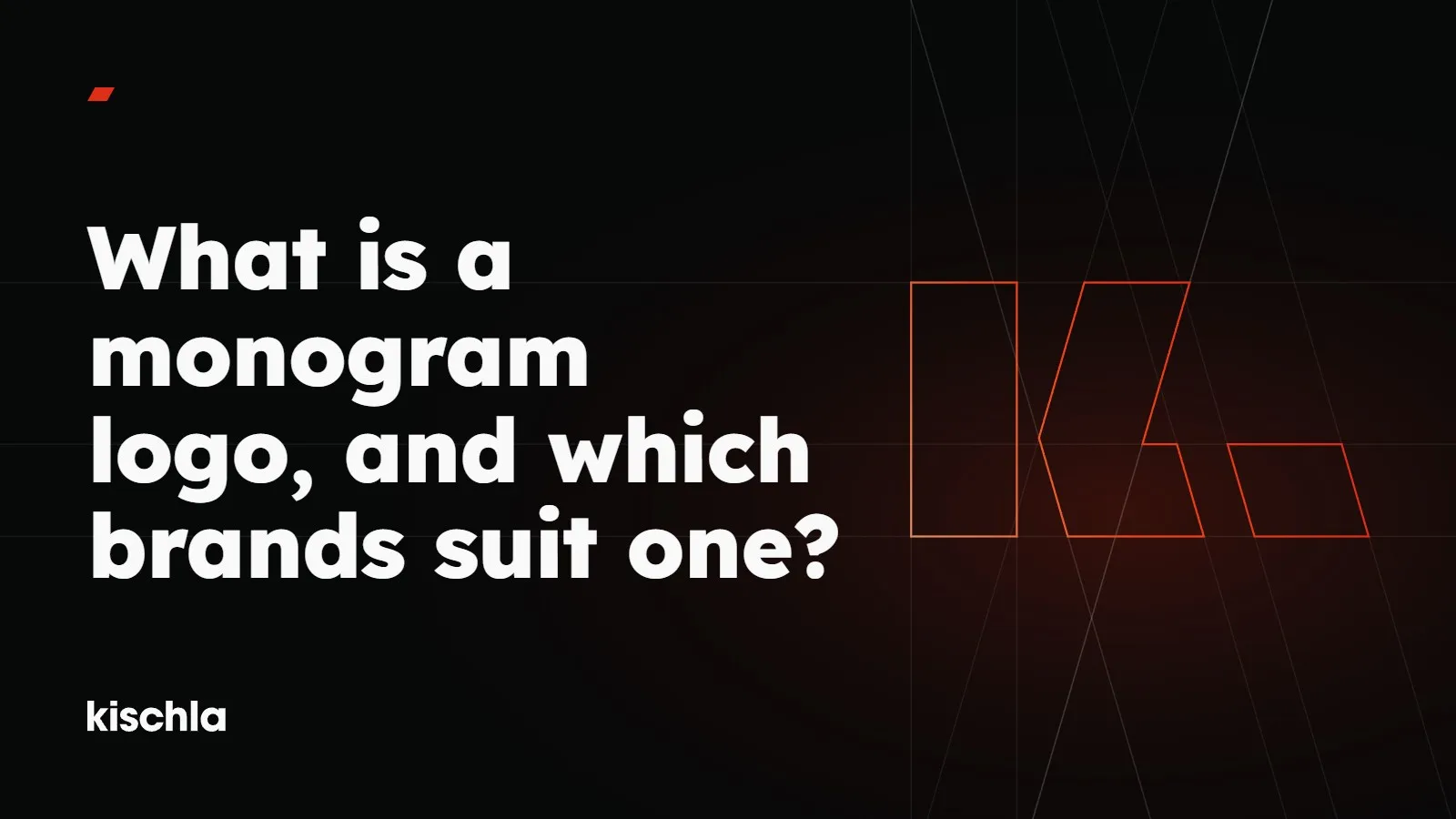
A mark drawn by eye changes a little every time someone redraws it. If a monogram is going to be used at sizes too small to hide that, building it on a grid matters even more. Our own K was built this way: upright lines, level lines and guides at one angle, running both ways. The chevron’s edges lean 16 degrees off upright, and the full stop shares that slant at 36% of the K’s height.
Built marks can be rebuilt exactly. Drawn ones drift.
You can see identities built around a monogram in our work. If you’d like to talk about the right shape for your logo, get in touch.