Strategy · 17 October 2026
What we mean by structure-led
Structure-led branding starts with what a brand needs to say, then builds a system that says it the same way everywhere.
We call ourselves a structure-led branding agency. It can sound like a slogan, so here’s what it means when you work with us.
Strategy before visuals
Before a brand looks like anything, it has to say something. Every project starts with analysis: who your brand is for, who it’s up against, what it says today and which of its current assets still work. The answers become a roadmap, and everything we design has to agree with it. Design comes after those answers, not instead of them.
A system, not a set of files
A logo on its own can’t hold a brand together. What holds it together is a system: the mark in every version it needs, colour defined for screen and print, one typeface with rules, clear space and a grid, and the touchpoints where all of it is applied. We wrote about those five parts in What is a corporate identity?
For Misho, the system started from two words, Organic Minimalism, and ran through a monogram, a palette named after materials, packaging and letterpress stationery. For Pekin Yapı Market, it meant a hexagonal P, a red defined for screen, paint and print, and stationery delivered as print files.
The point of a system is that your next decision is already half made. When you need a new business card, a new page or a new post, the rules are there before anyone opens a file.
Clarity over complexity
Our positions are simple, and we know not everyone shares them. Clarity beats complexity. Balance beats excess. A timeless identity beats whatever is trending this season. Precise beats loud.
Not loud, but precise. Not cluttered, but balanced.
What it looks like on our own brand
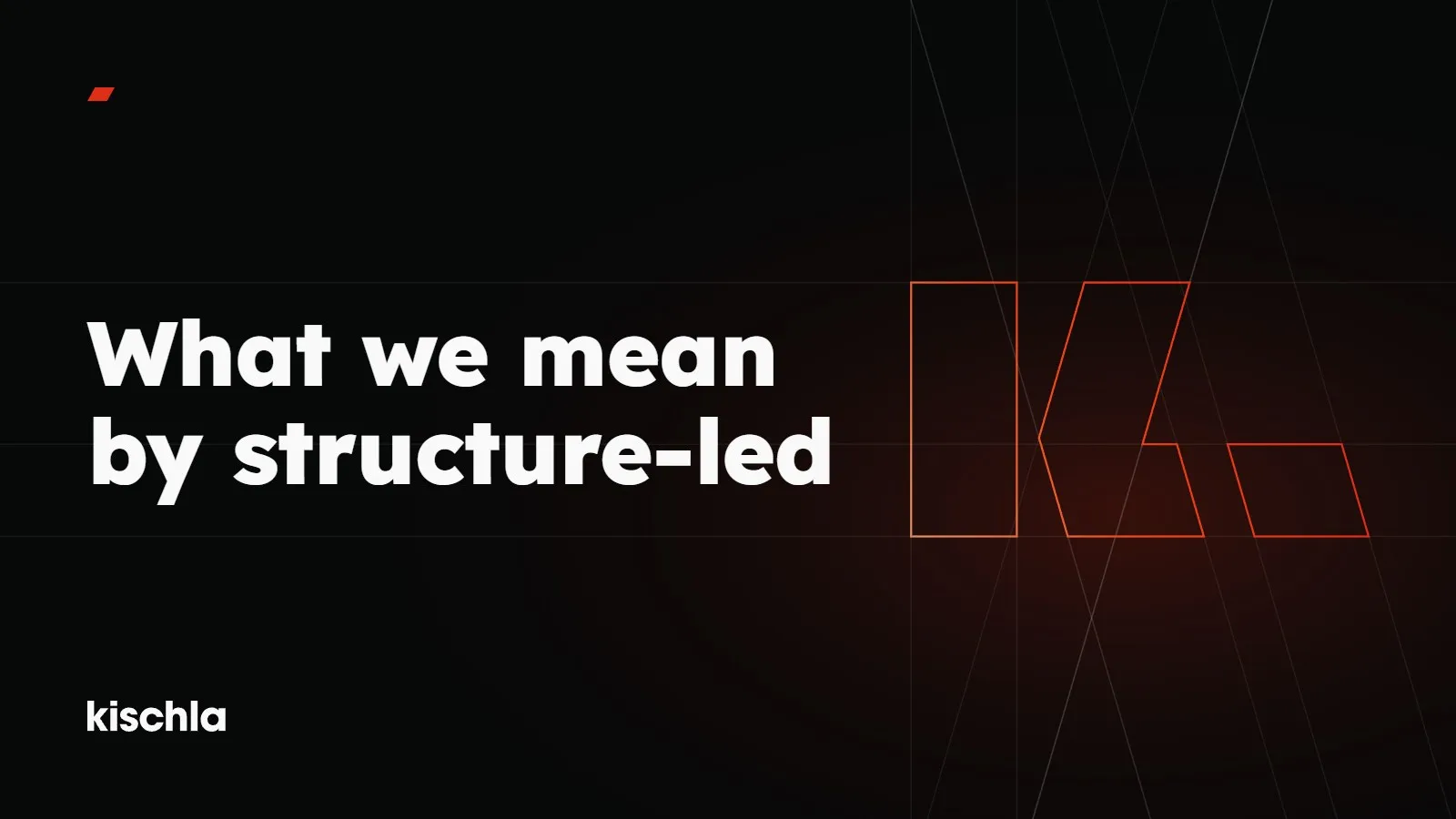
Our mark is built the same way we build client identities. The K is three shapes: an upright bar, then a chevron and a full stop cut at the same slant. There’s one accent colour, a red (#DF2E17), used once per layout. There’s one typeface, Lexend, in four weights: Light, Regular, SemiBold and ExtraBold. On Instagram, our first three posts were three words: Structure, Strategy, Design.
What it doesn’t mean
Structure-led doesn’t mean rigid, and it doesn’t mean every brand ends up looking the same. Misho and Pekin share nothing on the surface: one is an atelier for luxury interiors and gifting, the other a hardware store. The structure is underneath. What sits on top of it is different for every brand, because every brand has something different to say.
We Design, You Grow.