- Sector
- Our own identity
- Scope
- Services
The work
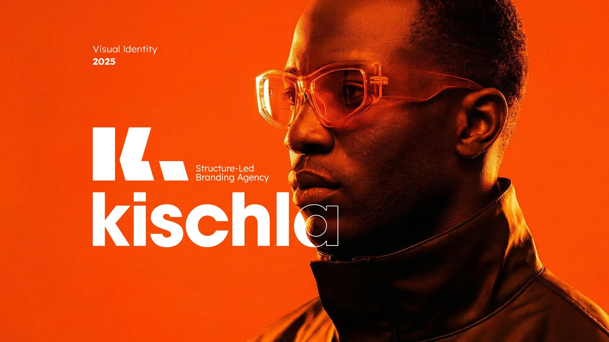
Our own identity had to practise what we preach: one idea, a clear system and room to breathe.
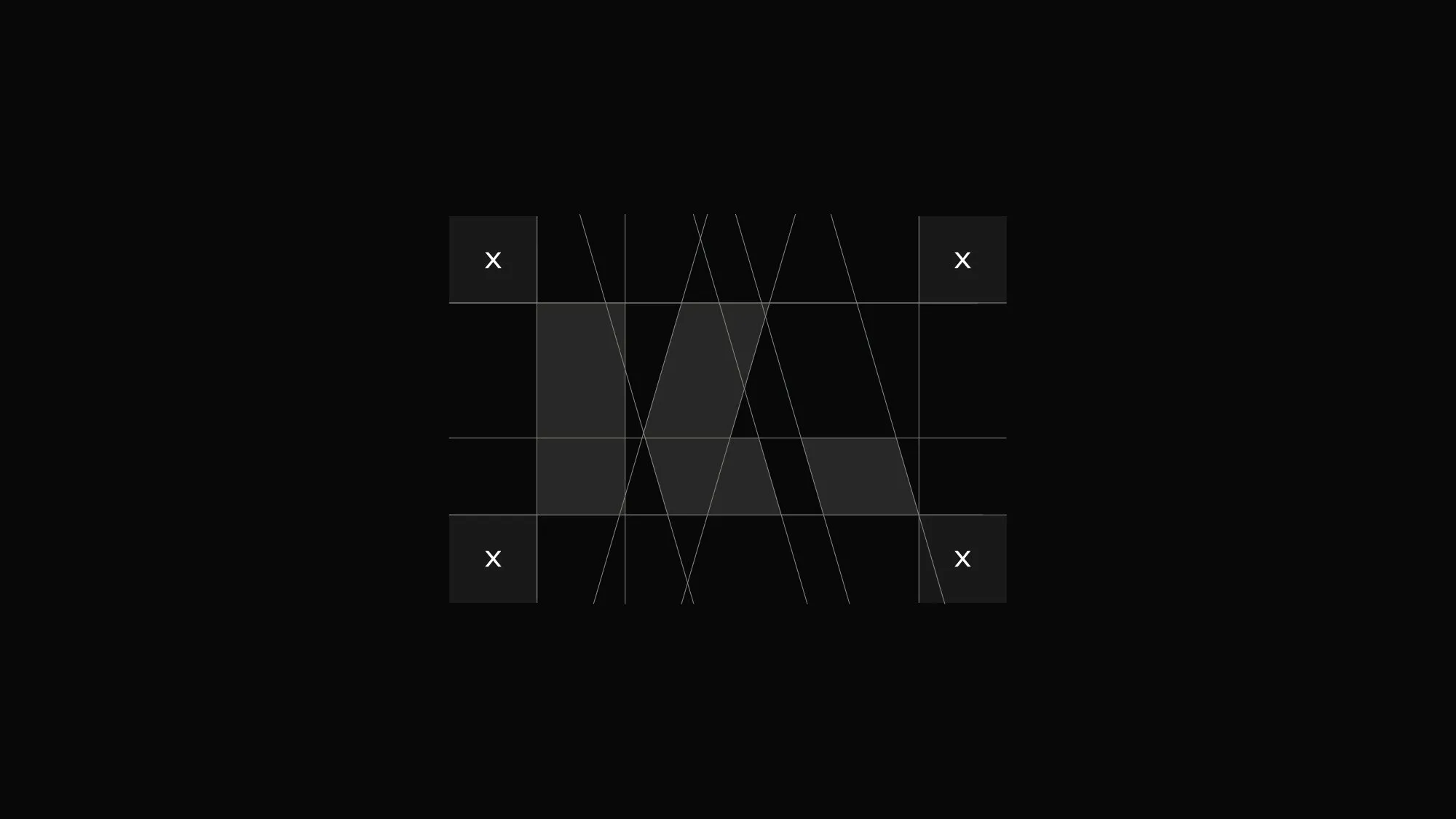
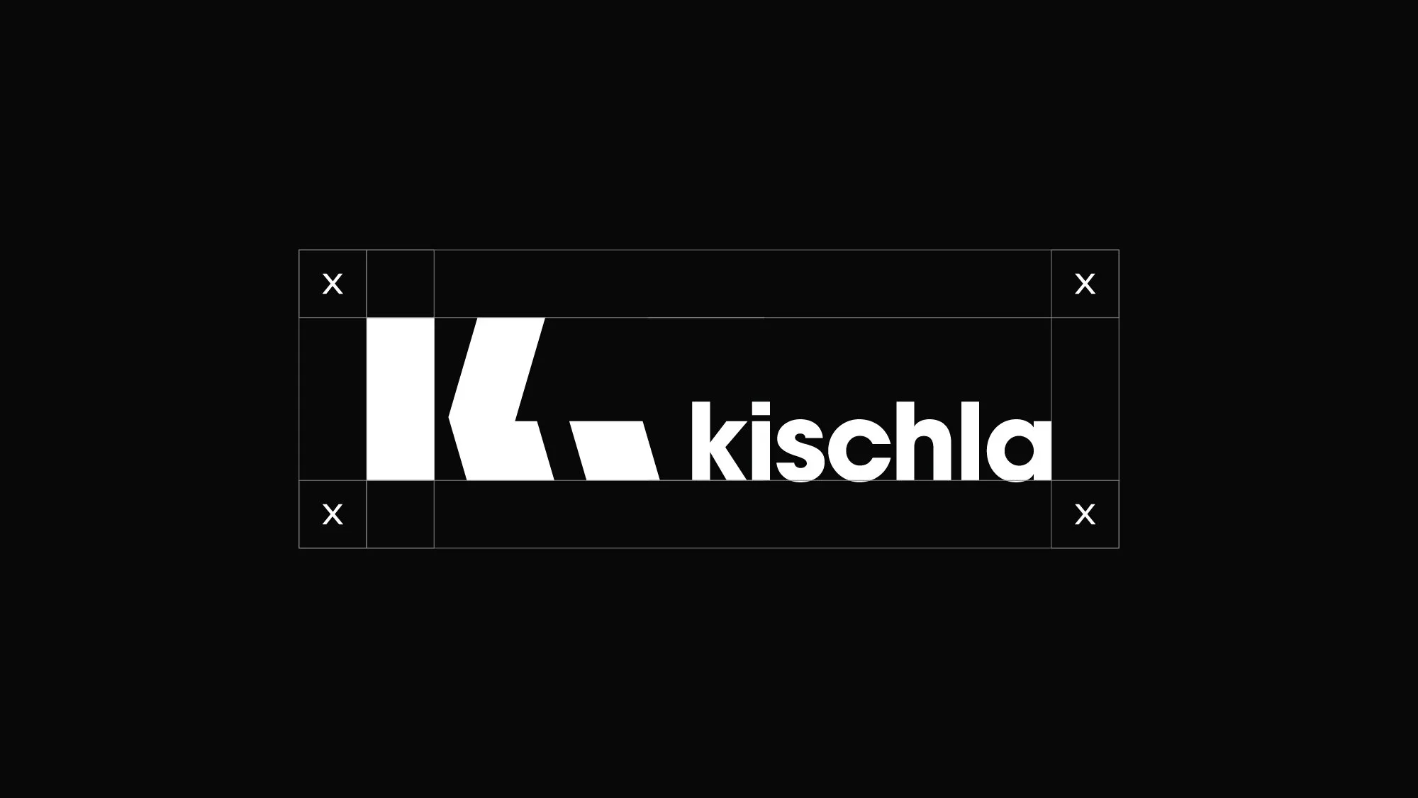
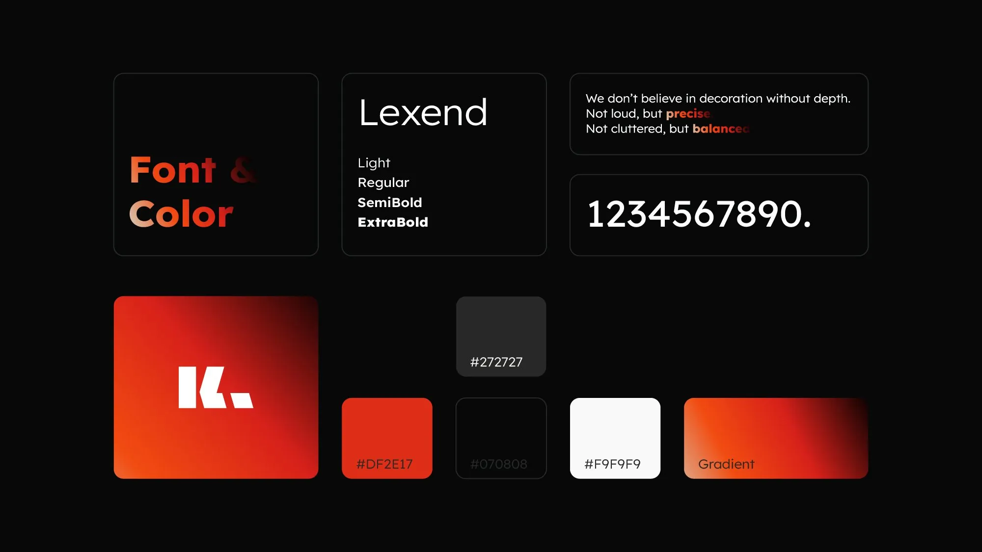
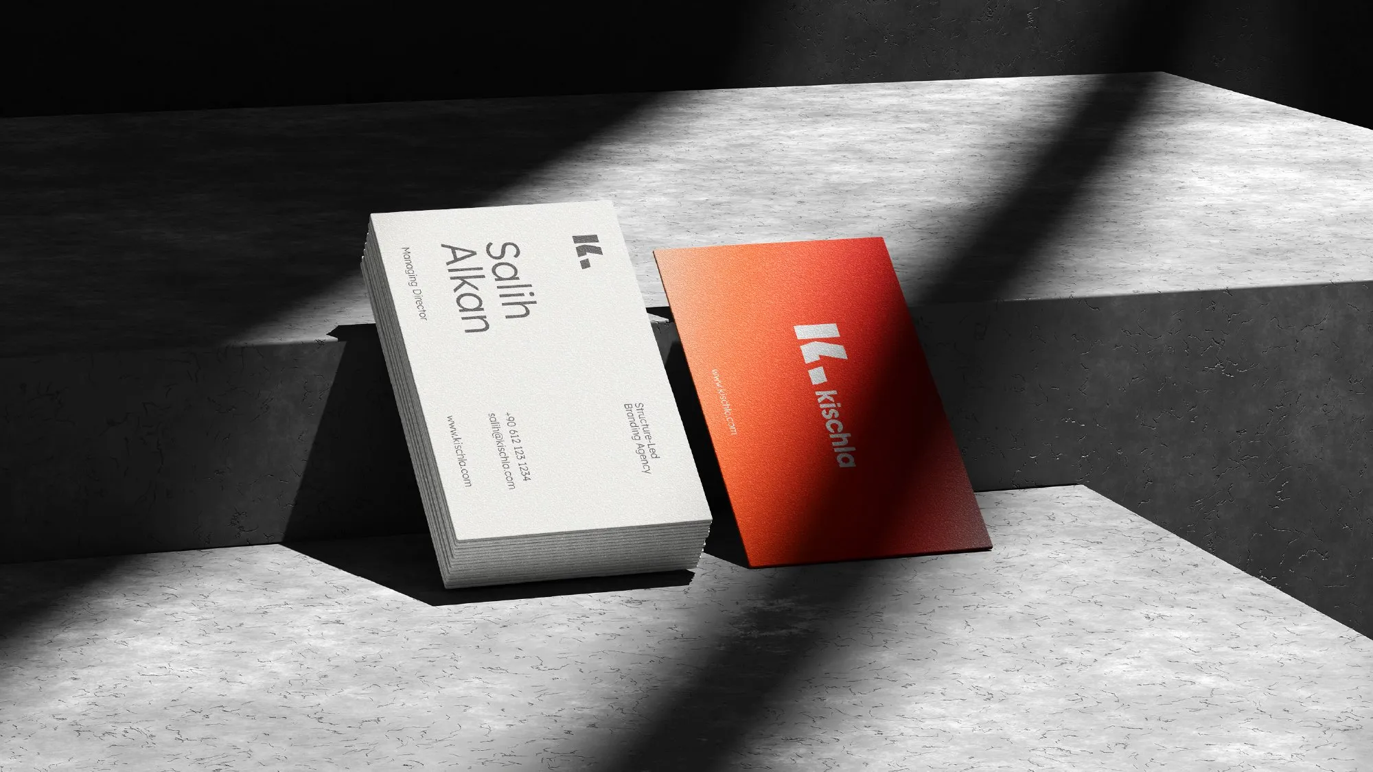
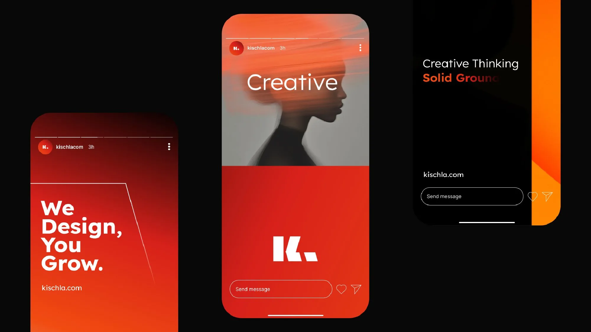
The mark is built from three shapes and two angles: an upright bar, and a chevron and a full stop that share one slant. Lexend carries the voice, a red accent and a peach-to-red gradient carry the energy, and the same rules run from the business card to the Instagram grid.
Full presentation on Behance