- Sector
- Online grocery for natural food
- Scope
- Services
The work
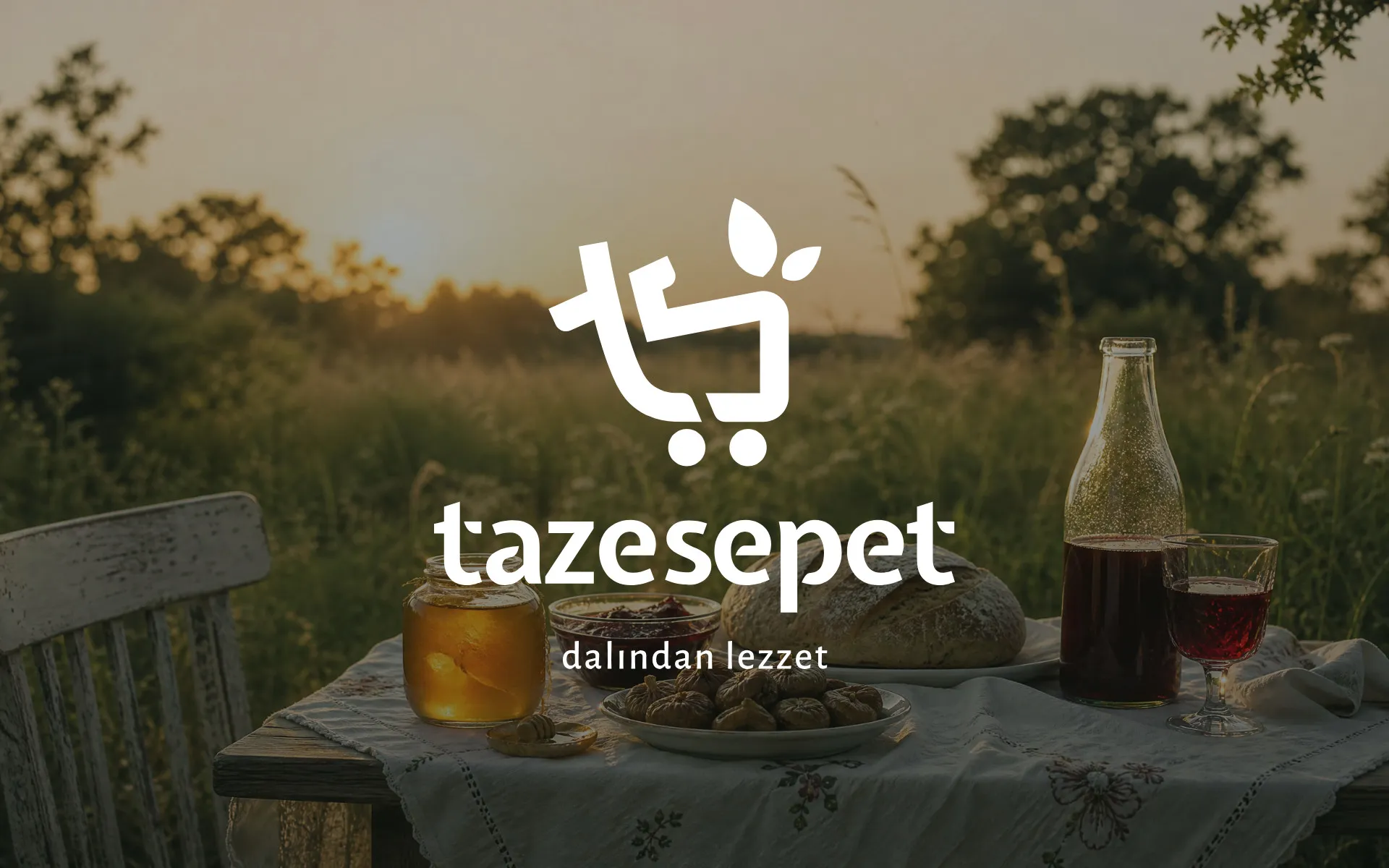
Taze Sepet means "fresh basket". It's an online grocery for natural, regional Turkish food, from honey, jam and figs to hazelnuts, olives, tarhana and handmade erişte, sourced directly from local producers. Its line is "dalından lezzet": taste straight from the branch.
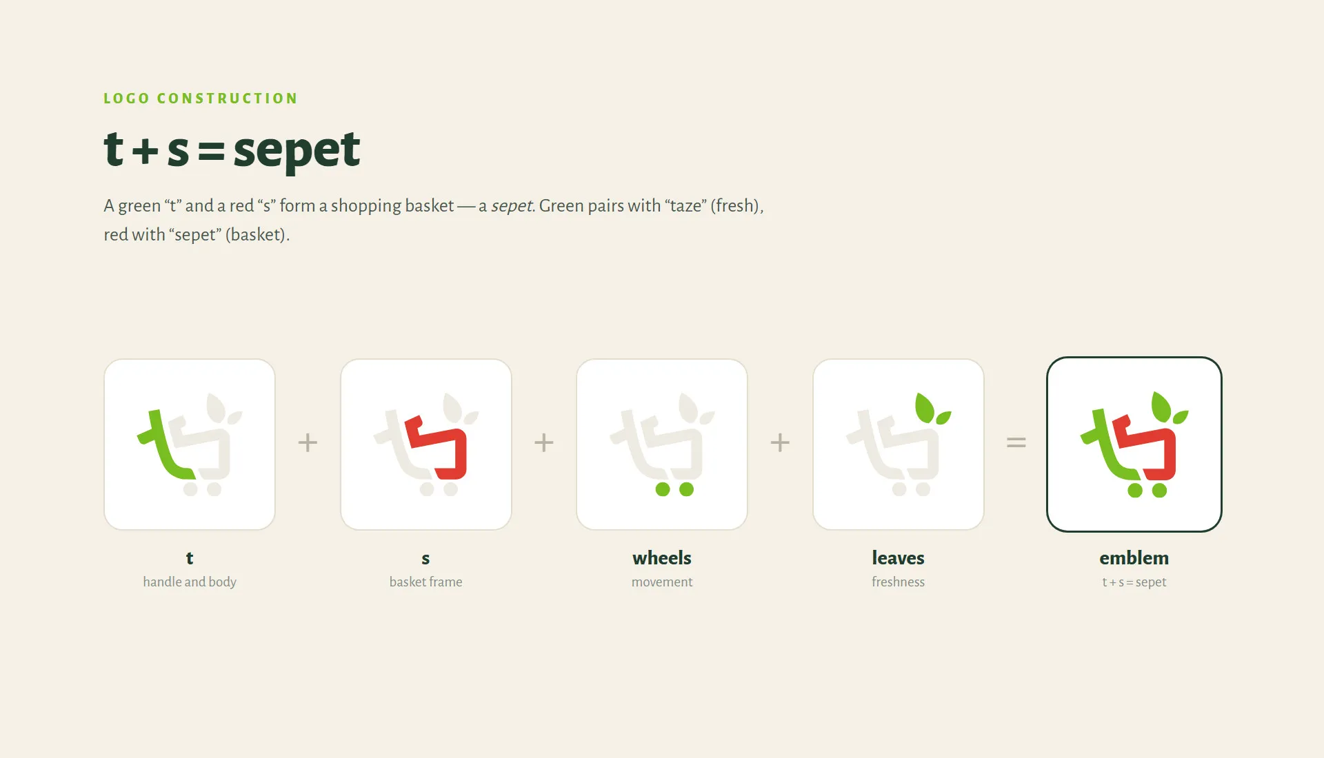
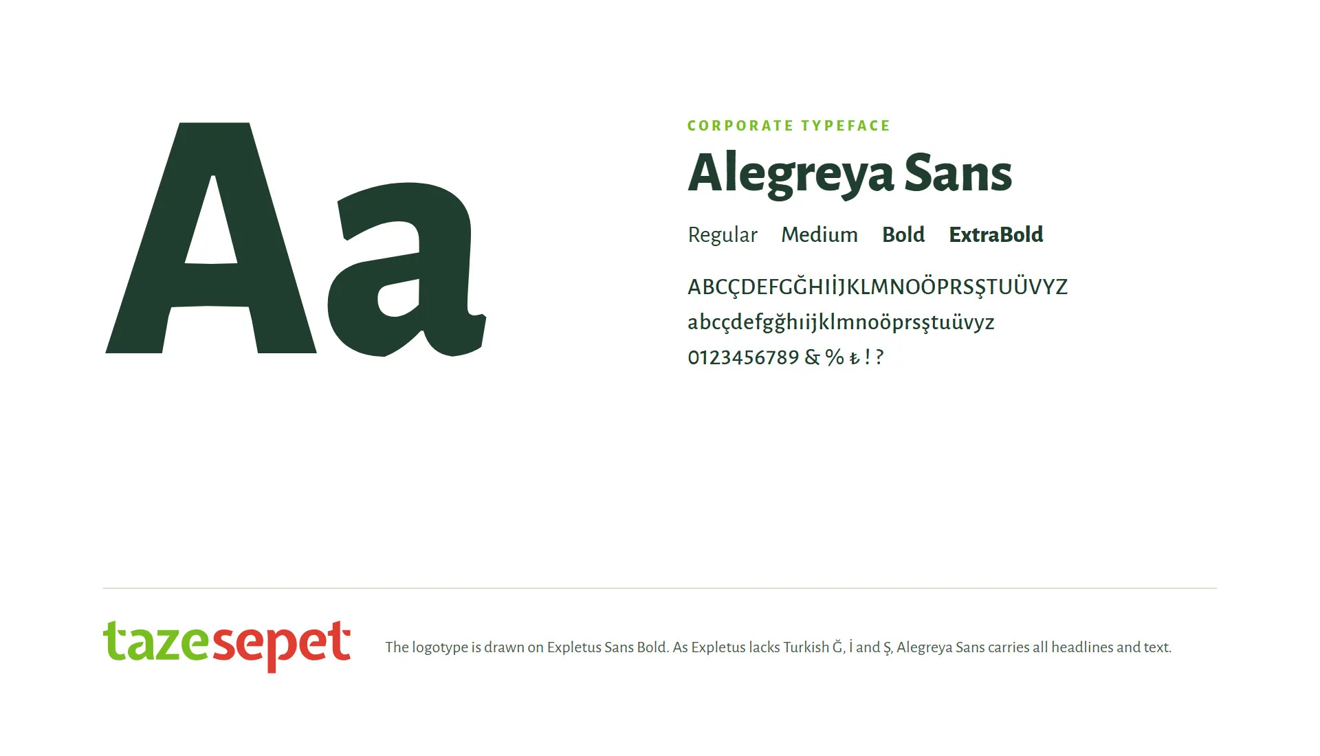
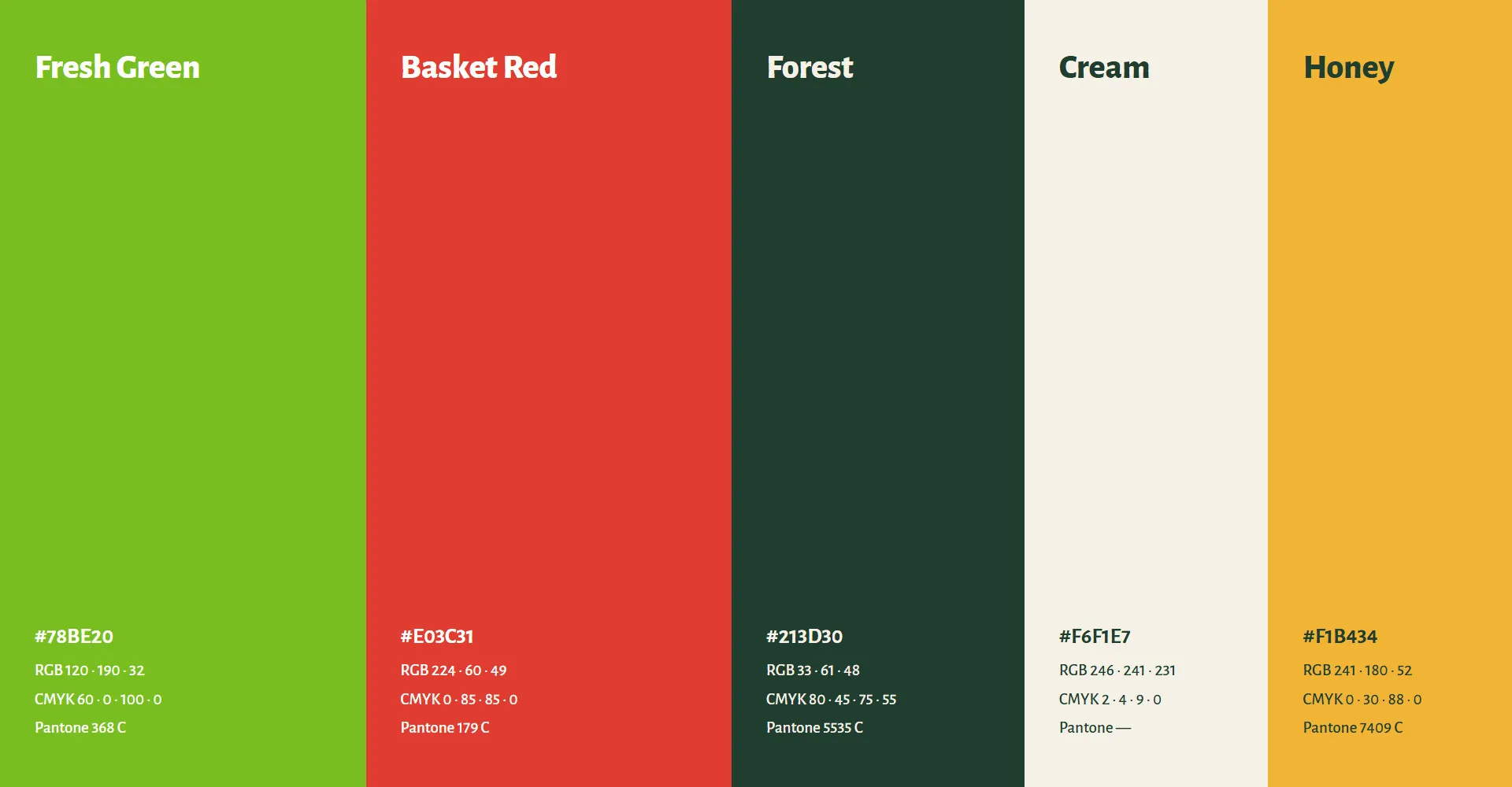
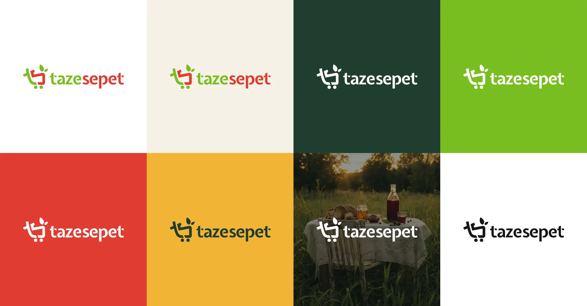
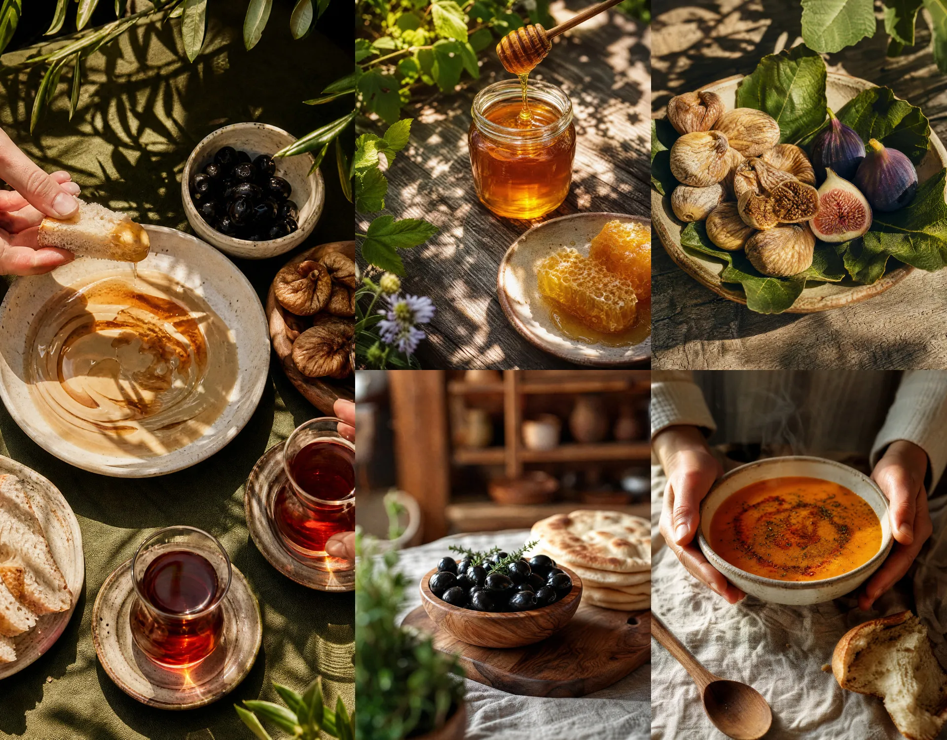
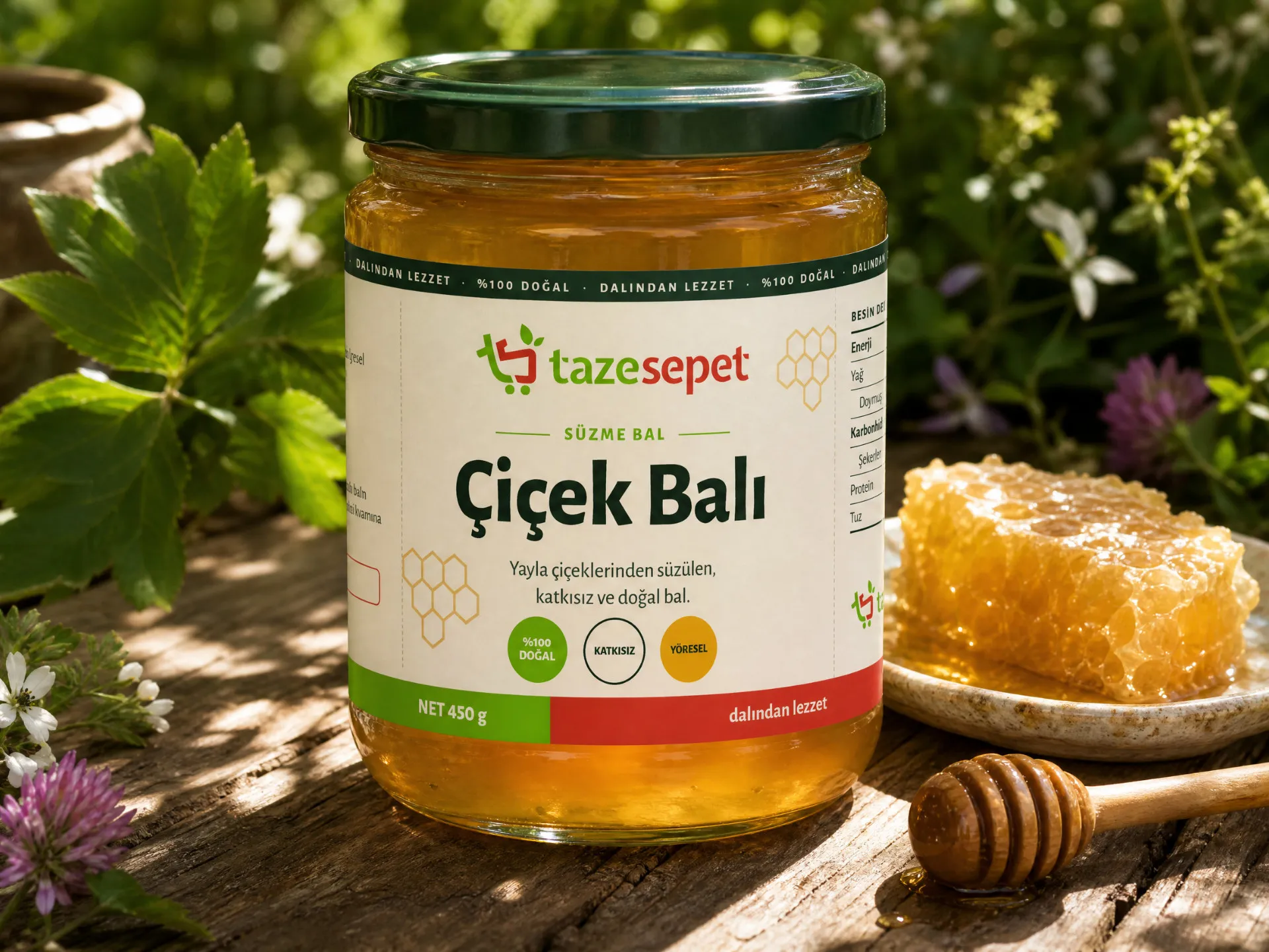
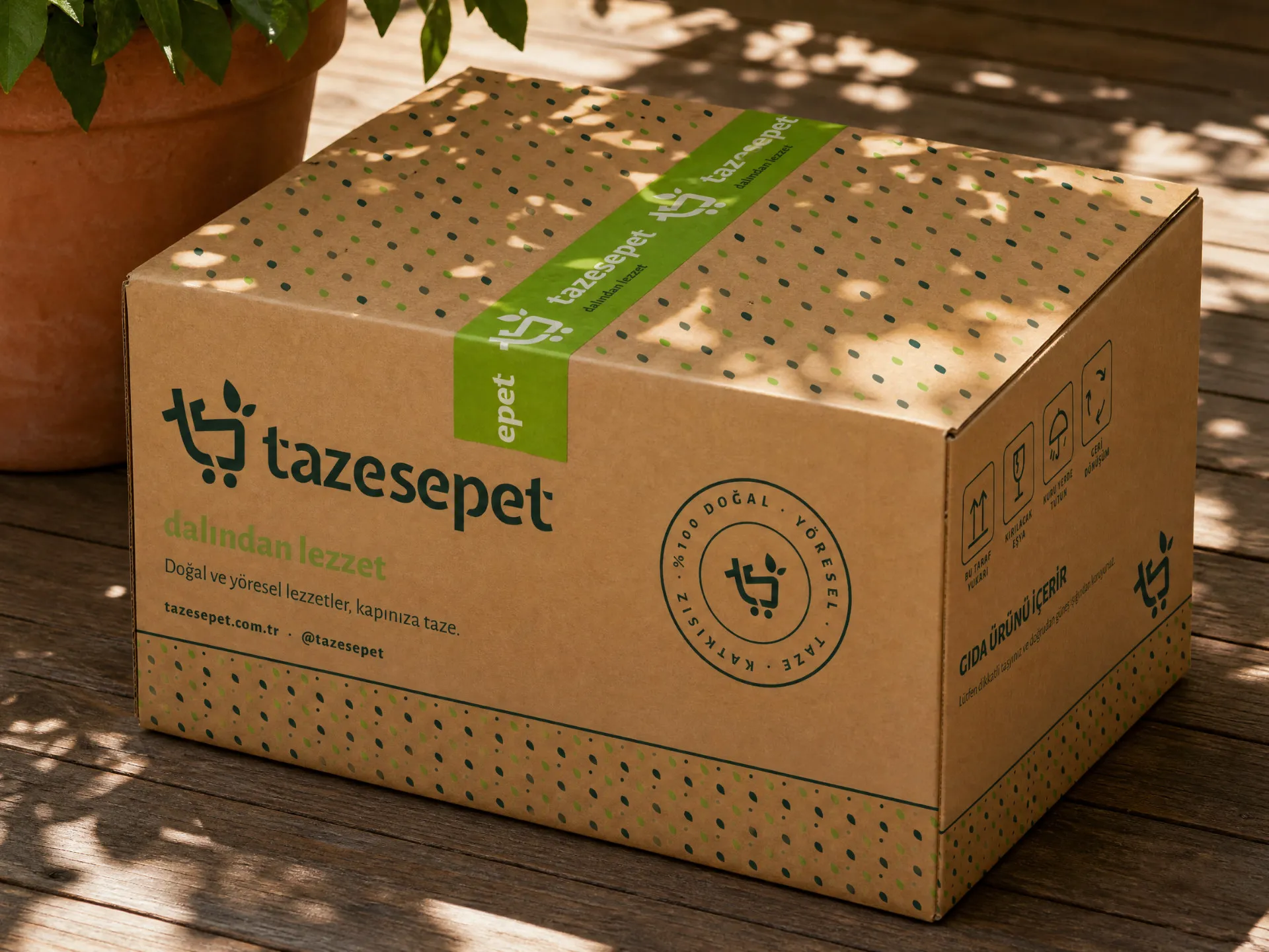
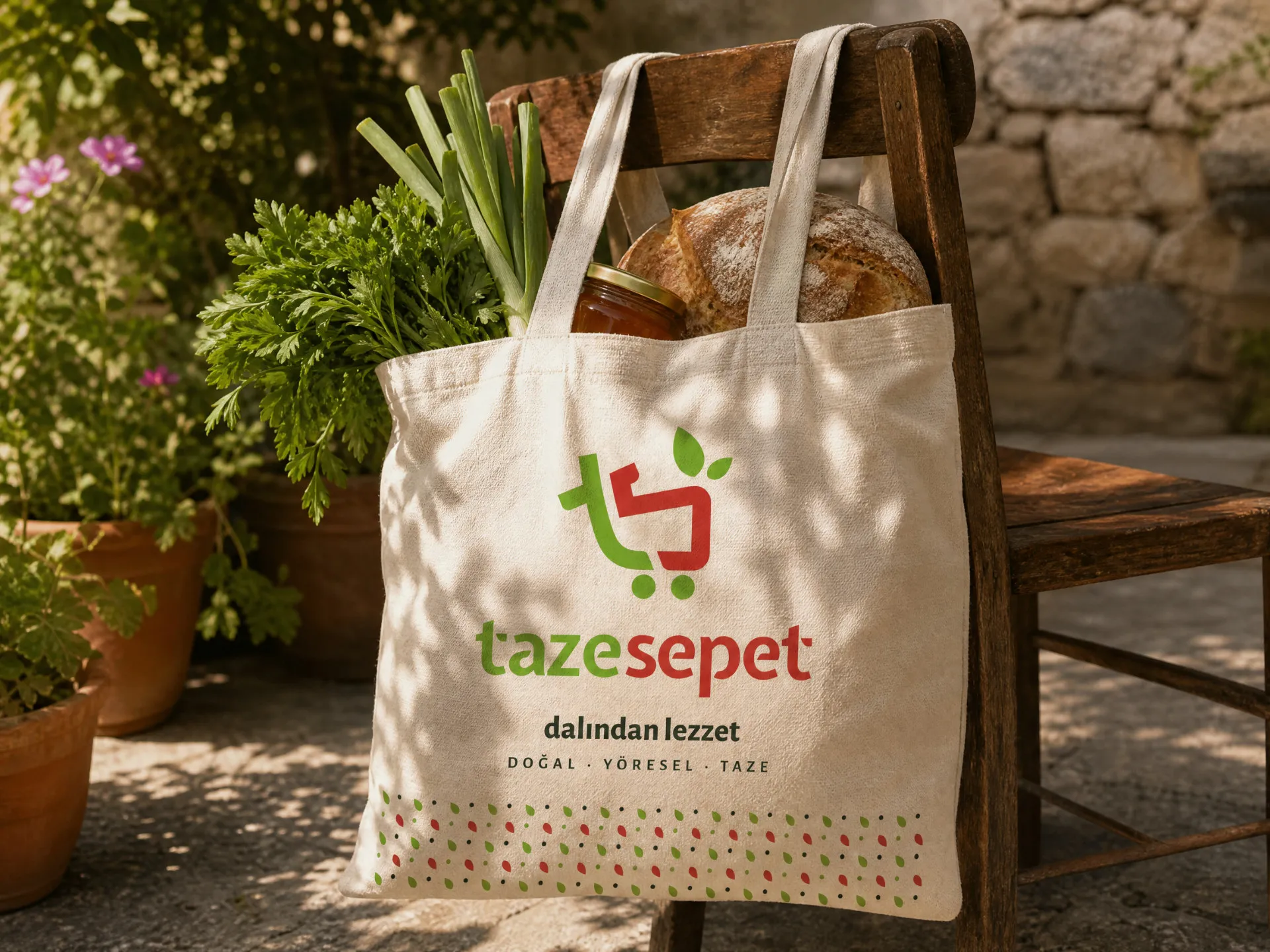
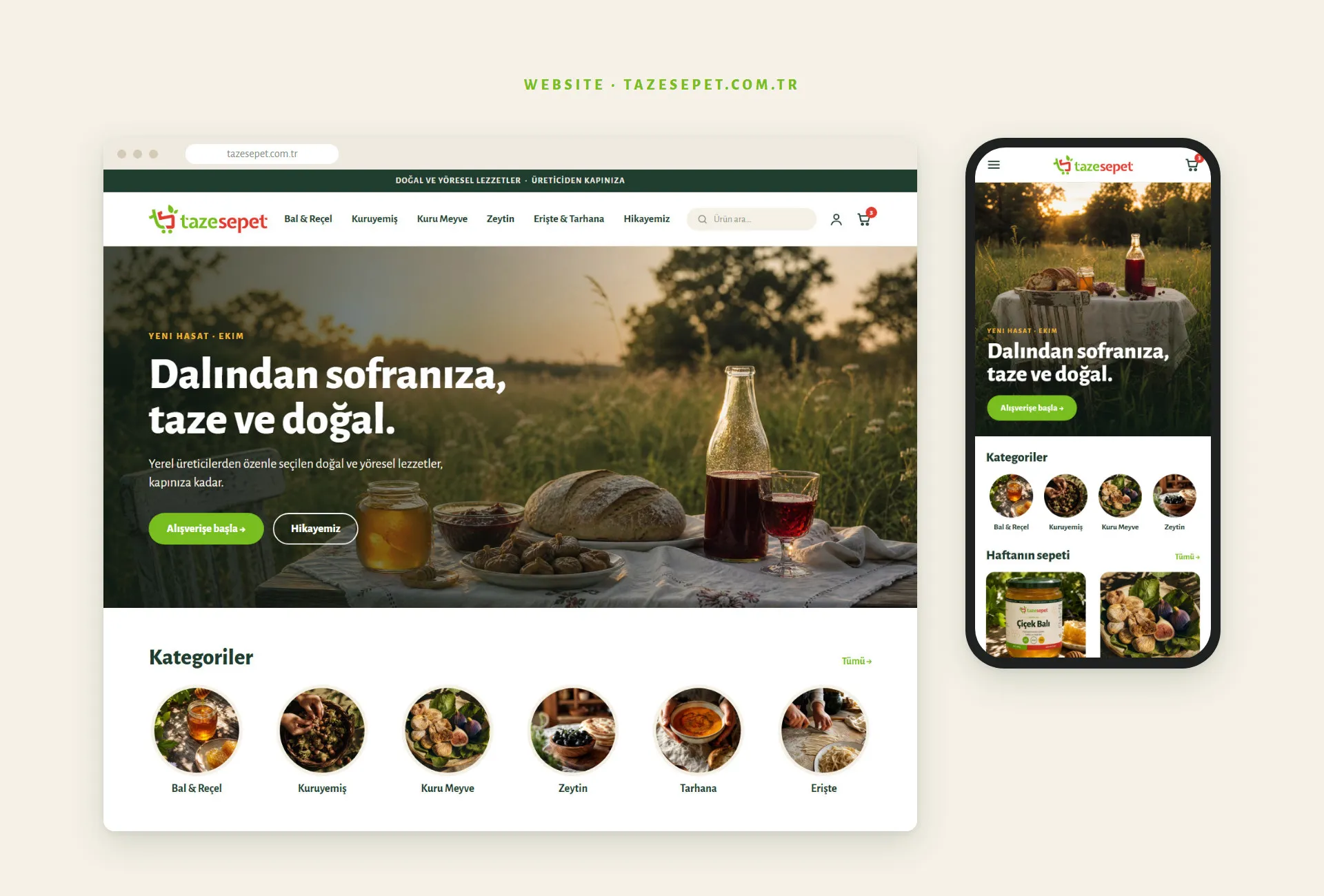
In the mark, a green "t" and a red "s" form a shopping basket. We didn't change that idea: we made it simpler. We took out the hand-drawn basket mesh, redrew the leaves as clean, solid shapes and moved the colours from neon green and crimson to leaf green and tomato red. Then we built a warm, food-first system around it: five colours (Fresh Green, Basket Red, Forest, Cream and Honey), Alegreya Sans as the one corporate typeface, a leaf-and-wheel pattern, a sunlit photography direction and designs for packaging, stationery, social media and the website.